The Gruen Watch Catalog - July 2015 Updates
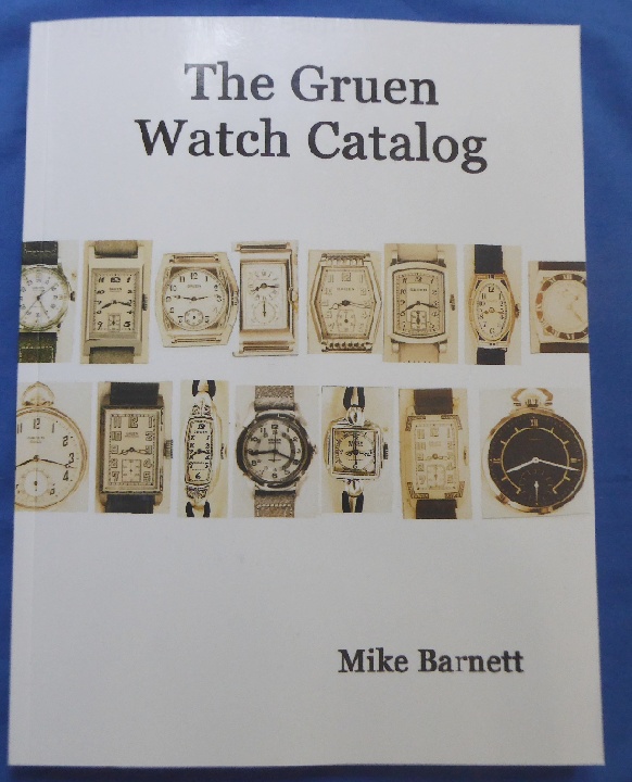
The Gruen Watch Catalog
NEW July 2015 Update compared
to December 2014 Version
NEW July 2015 Update compared
to December 2014 Version
 1 |
 2 |
 3 |
 4 |
 5 |
 6 |
 7 |
 8 |
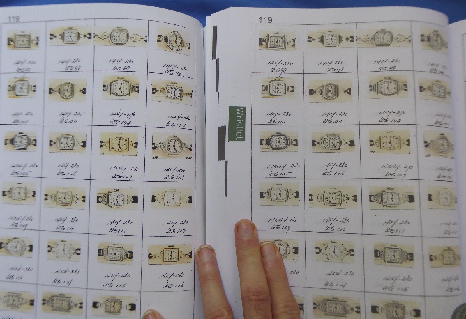
 9 |
 10 |
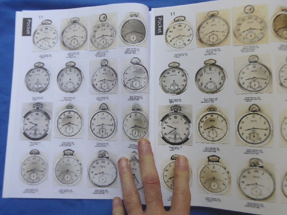
 11 |
 12 |
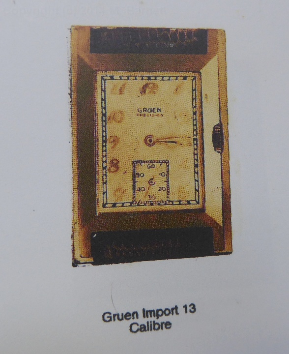
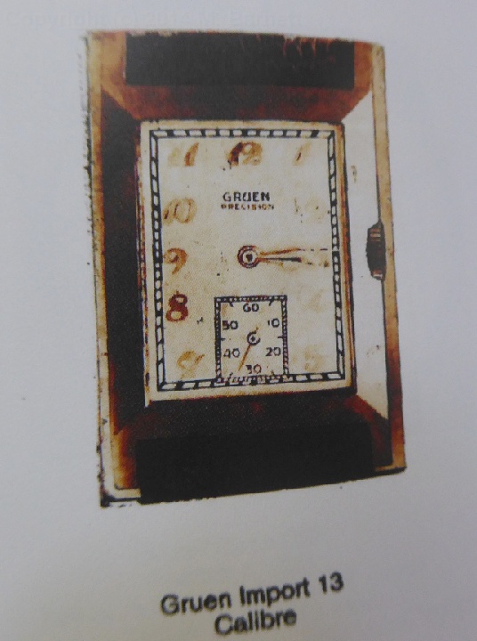
 13 |
 14 |
 15 |
 16 |
 17 |
 18 |
 19 |
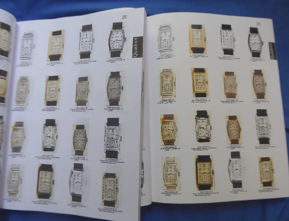
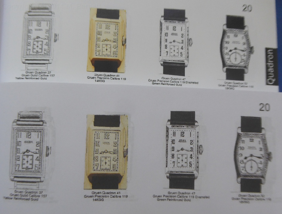
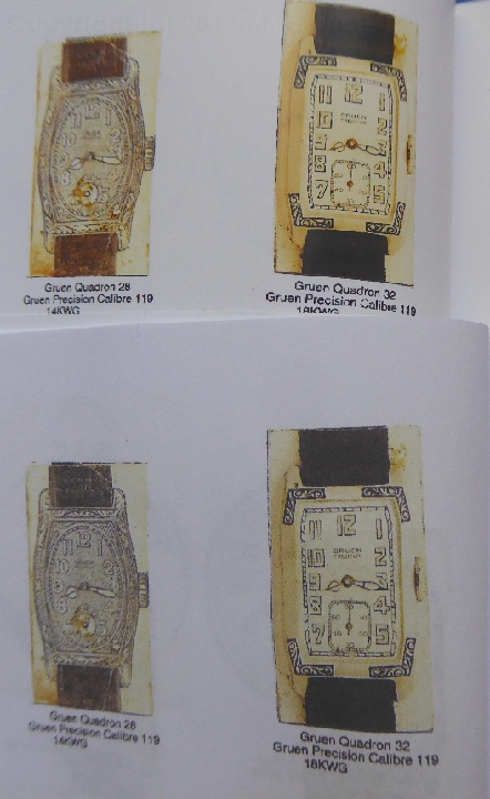
 20 |
 21 |
 22 |
 23 |
 24 |
 25 |
 26 |
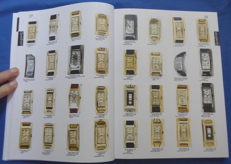
 27 |
 28 |
 29 |
 30 |
 31 |
 32 |
 33 |
 34 |
 35 |
 36 |
 37 |
 38 |
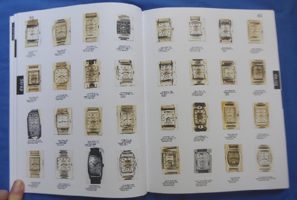
 39 |
 40 |
 41 |